
Client
Ascent
Click here to learn more about Ascent
Year
4/05/2025
Project Deliverables
Logo Refresh, Business Cards, Tri-Fold Brochure, Visual Style,
ASCENT
Project Scope: Branding Identity Refresh / Favicon
Ascent is all about meeting the needs for children with emotional and behavioral problems. The client requested a logo refresh. They also wanted a new favicon along with various other requests a branding kit, business cards, and other marketing materials.

Logo Design
the Ascent logo was designed to be simple, clean, and free of heavy symbolism. The team wanted to avoid anything preachy or outdated, favoring modern sans-serif fonts and subtle meaning. "Ascent" reflects the uphill journey of overcoming challenges a metaphor for growth, resilience, and rising above. Like climbing a mountain, it's hard, exhausting, and requires support but reaching the top brings clarity and purpose. The logo captures this spirit without being overly literal, representing a fresh perspective and a shift in thinking.
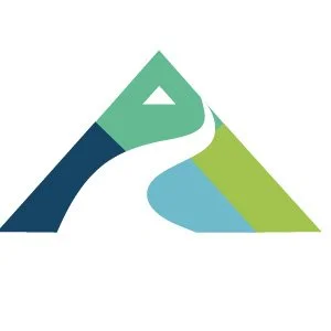

the favicon was created for Ascent’s website launch—distinct from the main logo but aligned with the brand. It features a simplified mountain and hill, symbolizing the journey children take to overcome challenges, reflecting Ascent’s mission and values.
Favicon


