Client
Fraktur Needle Tattoo Studio

Year
5/01/2024

Project Deliverables
Logo, Brand Guideline Sheet, Business Cards, Billboards, Social Media, and Poster Designs

Fraktur Needle tattoo Studio

Project Scope: Fraktur Needle Tattoo Studio

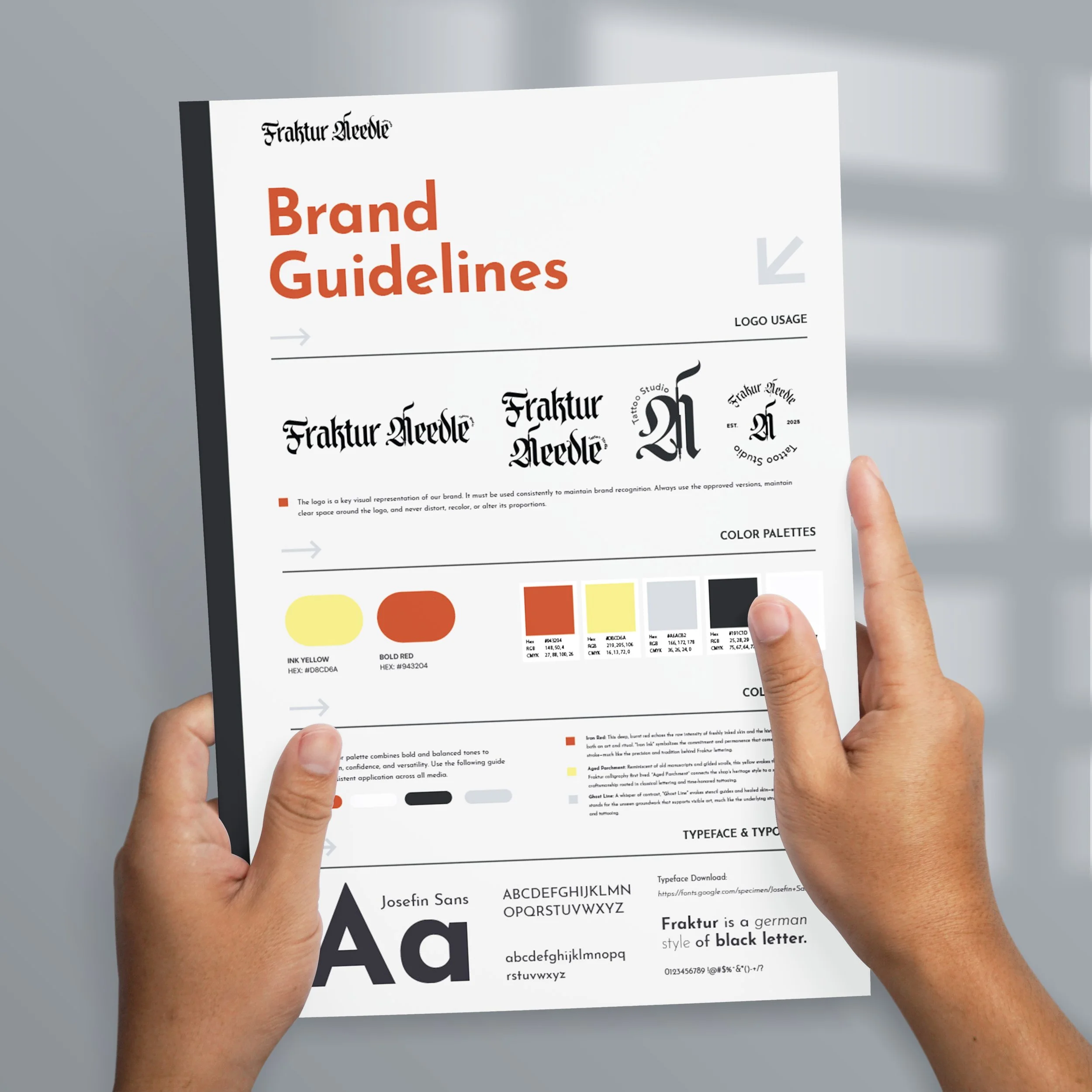
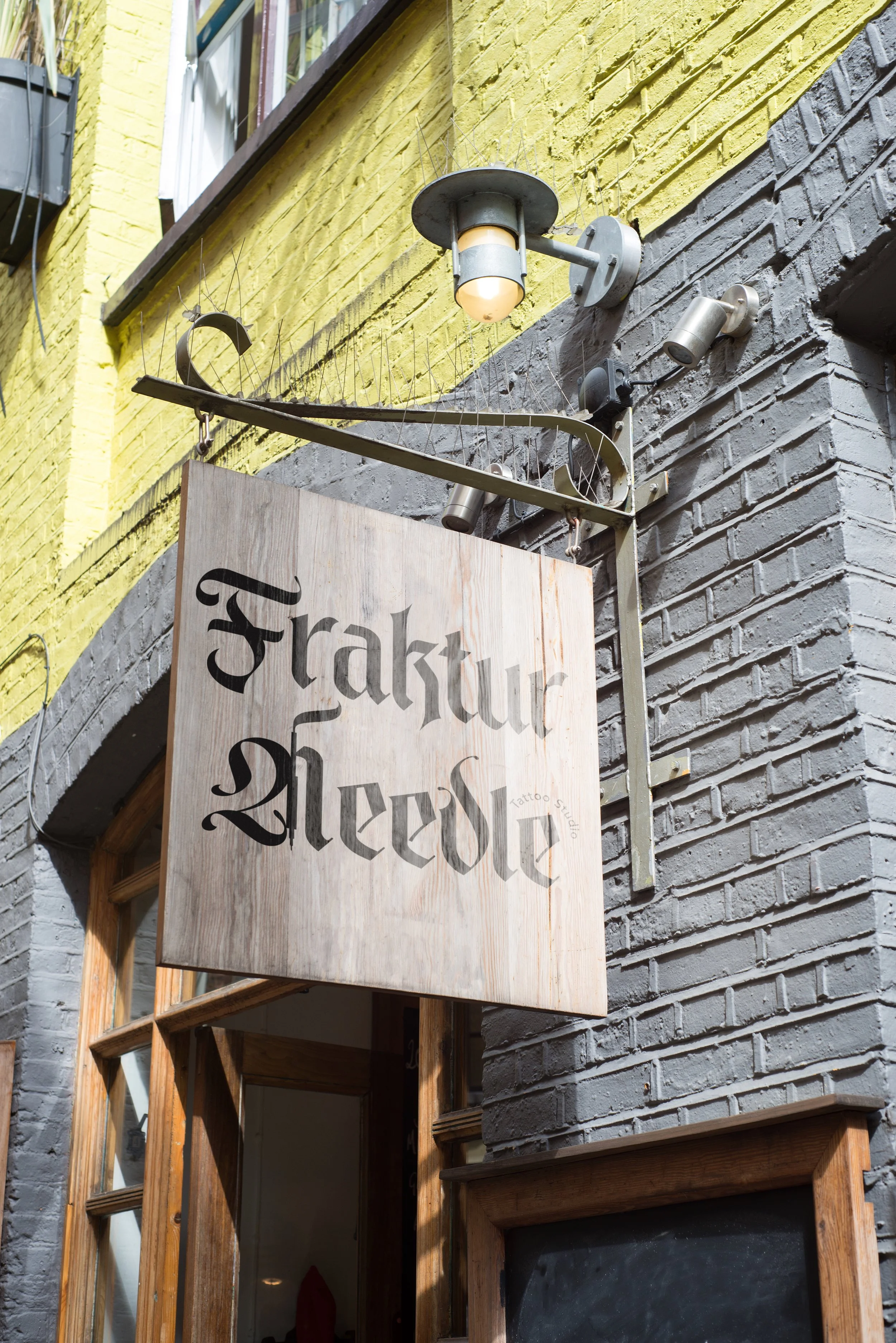
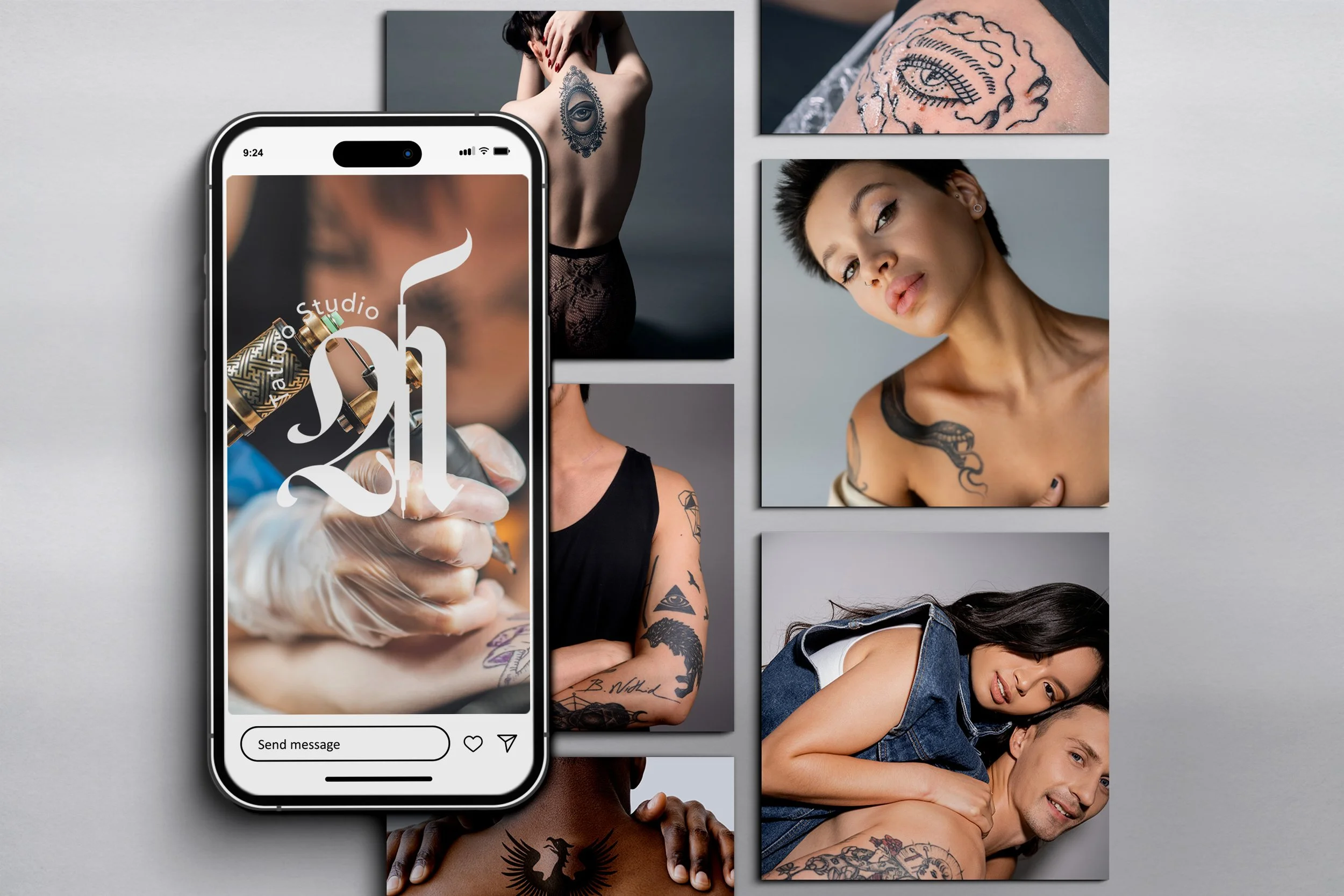
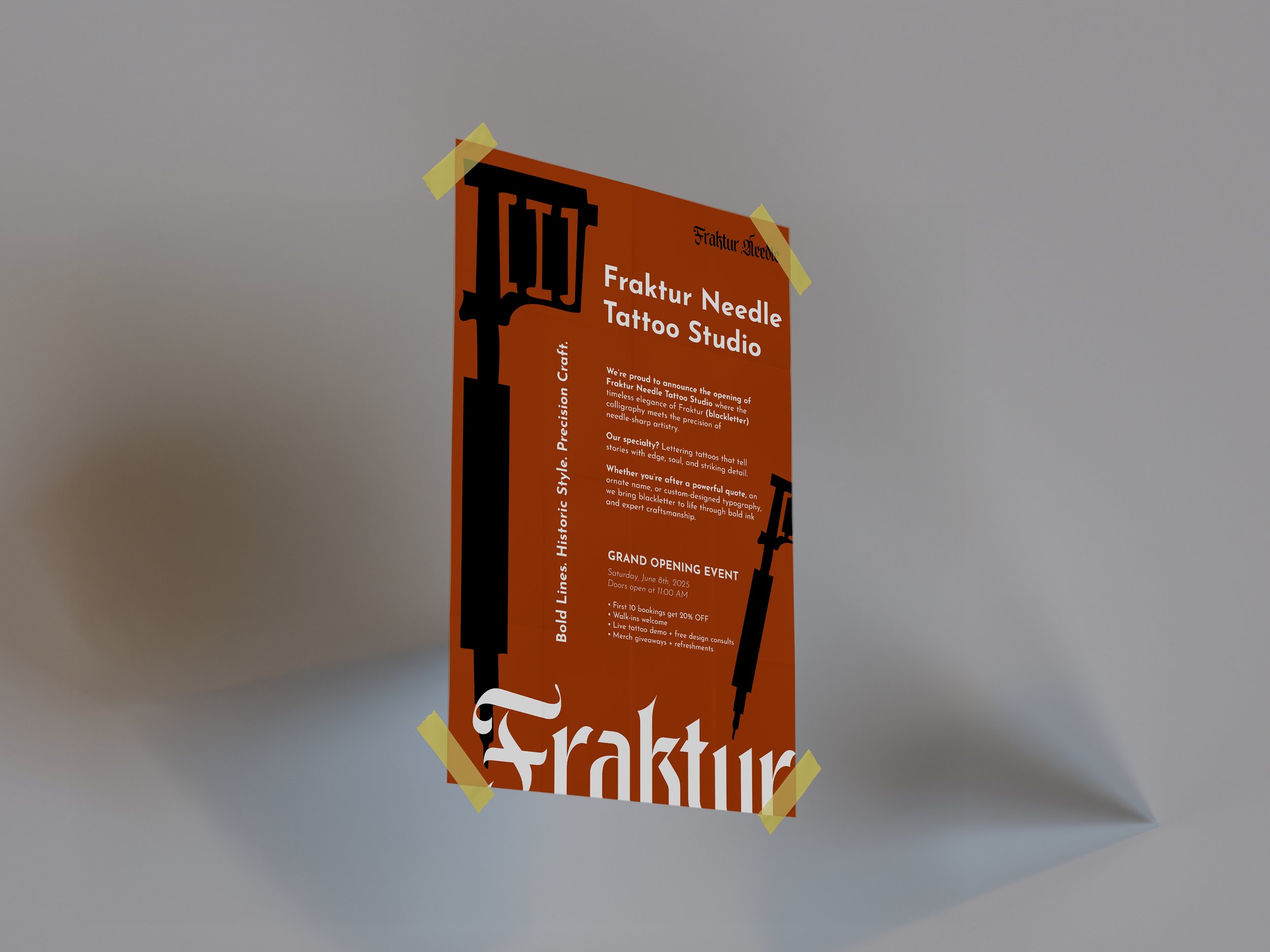
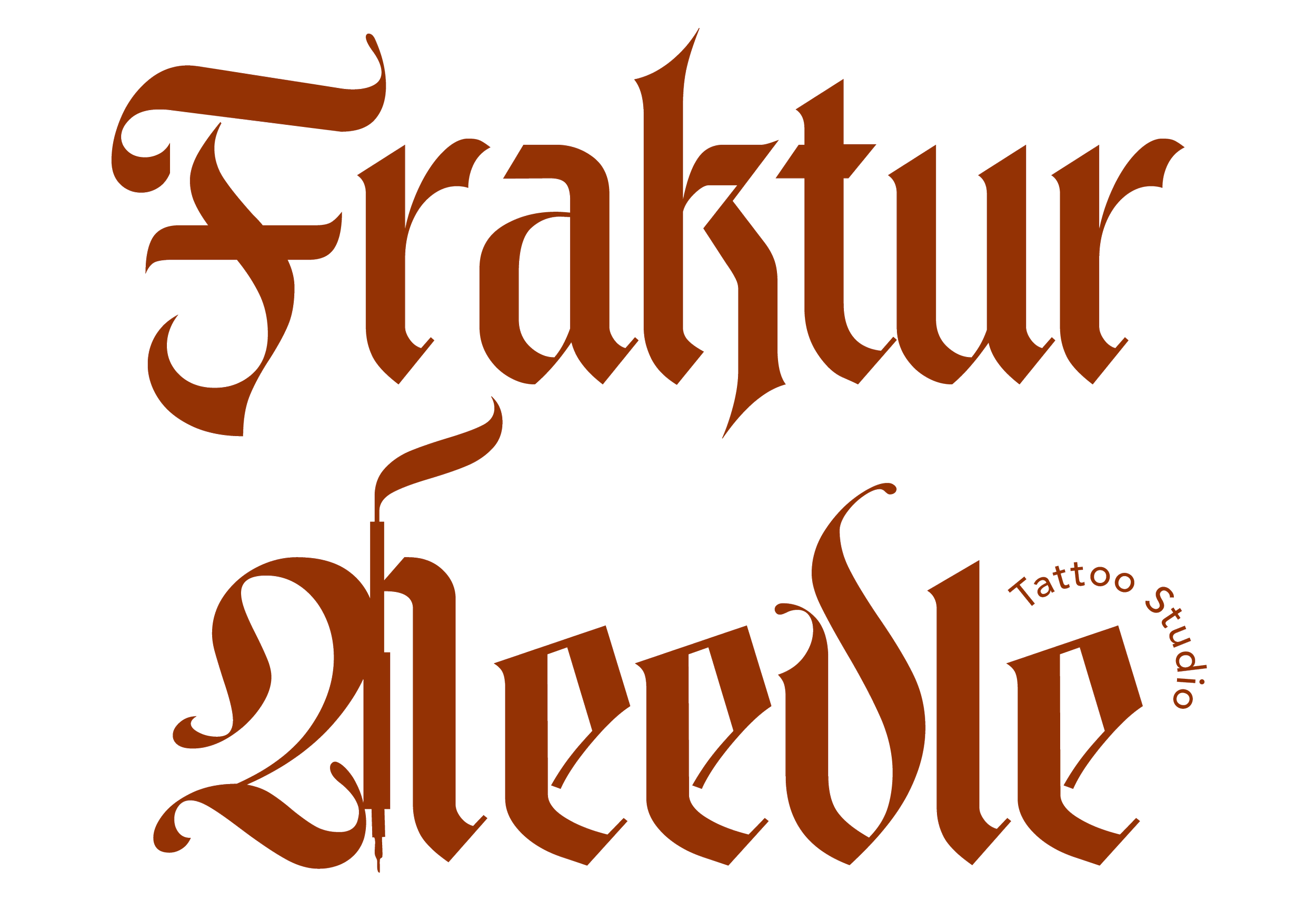
The goal of this project was to craft a distinct and memorable visual identity for Fraktur Needle Tattoo Studio. The studio requested a custom-designed wordmark logo, accompanied by a complementary submark variation. A key focus of the design was to emphasize the needle element, aligning with their specialization in precision tattooing specifically, lettering in the traditional Fraktur (blackletter) style. The final branding needed to reflect the studio’s artistic craftsmanship and niche expertise, combining the historical weight of blackletter typography with a modern, needle-focused edge.

Logo Development

Fraktur Needle Tattoo Studio approached me with a clear vision for their brand identity: they wanted a distinct wordmark rooted in traditional blackletter typography, highlighting their core specialization Fraktur-style lettering tattoos. The studio’s name itself is a nod to this specialization, and the logo needed to reflect both their artistic focus and professional expertise.

To meet this goal, we crafted a custom word mark using Fraktur-inspired forms, balancing sharp, historic details with modern refinement to give the mark boldness and clarity. This typographic approach positions the brand as modern and confident, while still honoring the deep tradition of blackletter styles.

In addition to the primary wordmark, the client requested a submark that emphasized the "Needle" element of their name. I integrated a stylized needle into the submark design.

Brand Guidelines

To support the launch of Fraktur Needle Tattoo Studio, I developed a concise and affordable brand guideline sheet designed for quick reference. The goal was to provide the client with a practical tool that clearly outlined their core visual identity focusing on logo usage, color palette, and typography.

The color system was carefully chosen to reflect the studio’s roots in traditional blackletter artistry while maintaining a bold, modern edge. The palette includes:

  • Red – Symbolizing freshly inked skin and the deep-rooted history of tattooing as a craft.

  • Yellow – Inspired by aged manuscript paper, referencing the classical origins of Fraktur lettering.

  • Grey – Representing “ghost lines” or stencil guides, tying into the technical precision of tattoo application.

  • Black and White – Providing strong contrast and reinforcing the timeless, high-impact look of blackletter typography.

Signage

For this signage design, the central focus is the word mark, positioned prominently and centered to immediately draw the viewer’s attention. This choice aligns with effective brand communication ensuring that the brand name is unmissable from a distance, anchoring the entire composition.

Next
Next

Tween Magazine