Client
Astro Sips

Year
12/30/2024

Project Deliverables
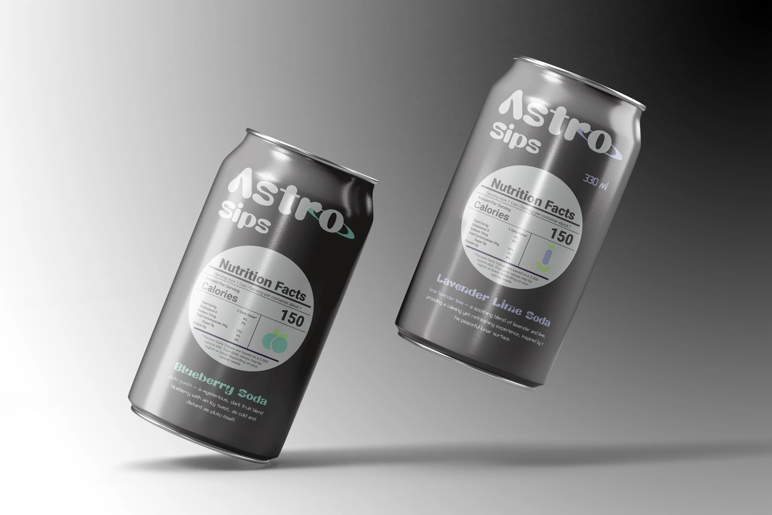
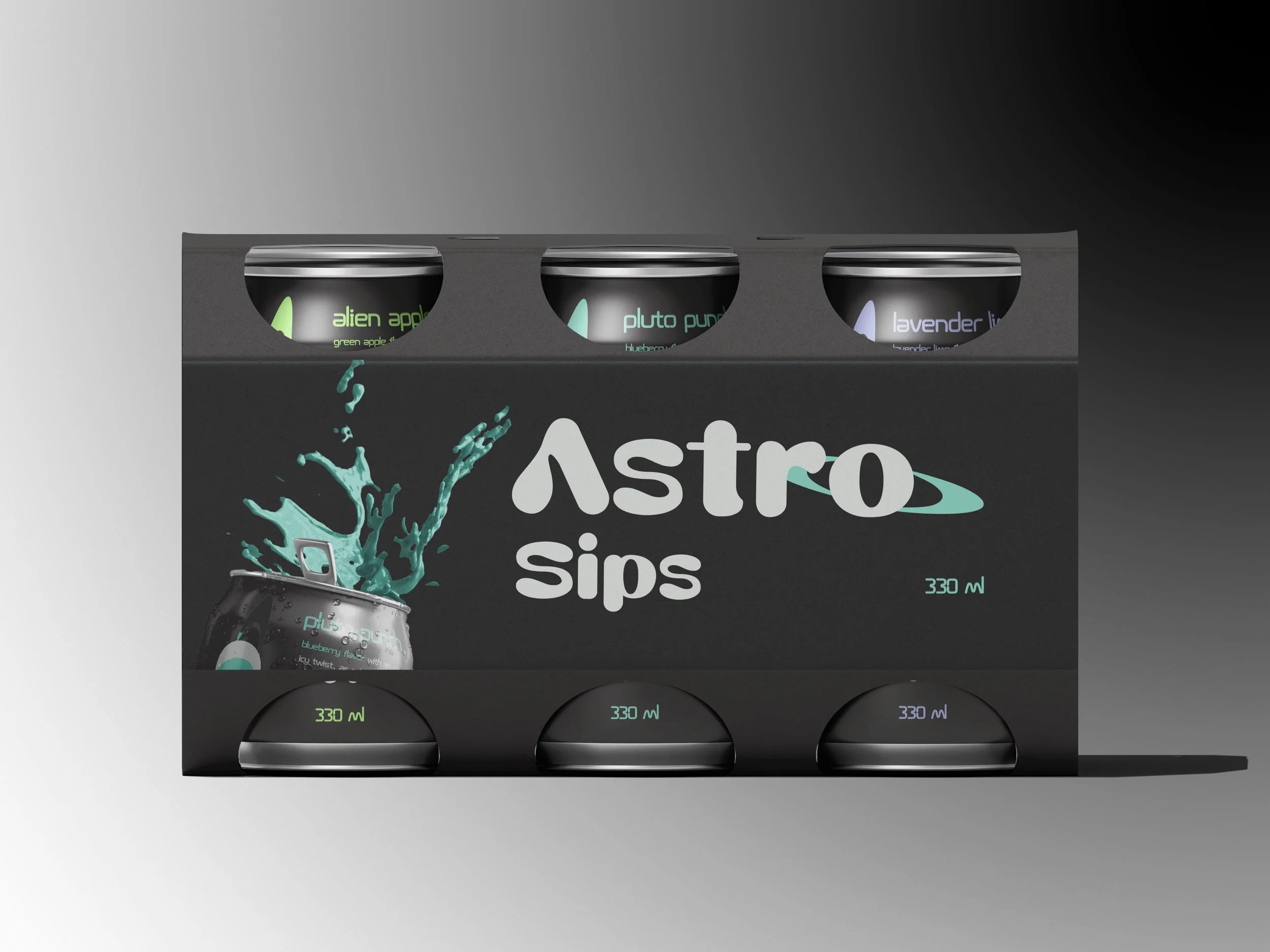
Astro Sips Logo and Packaging Design

Astro SIps Soda

Project Scope: Astro Sips Soda Design

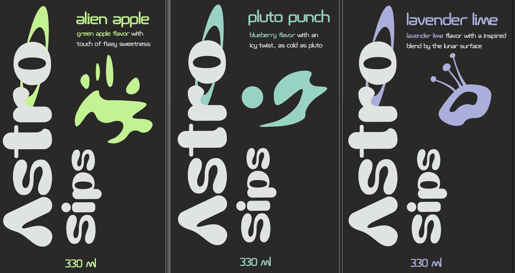
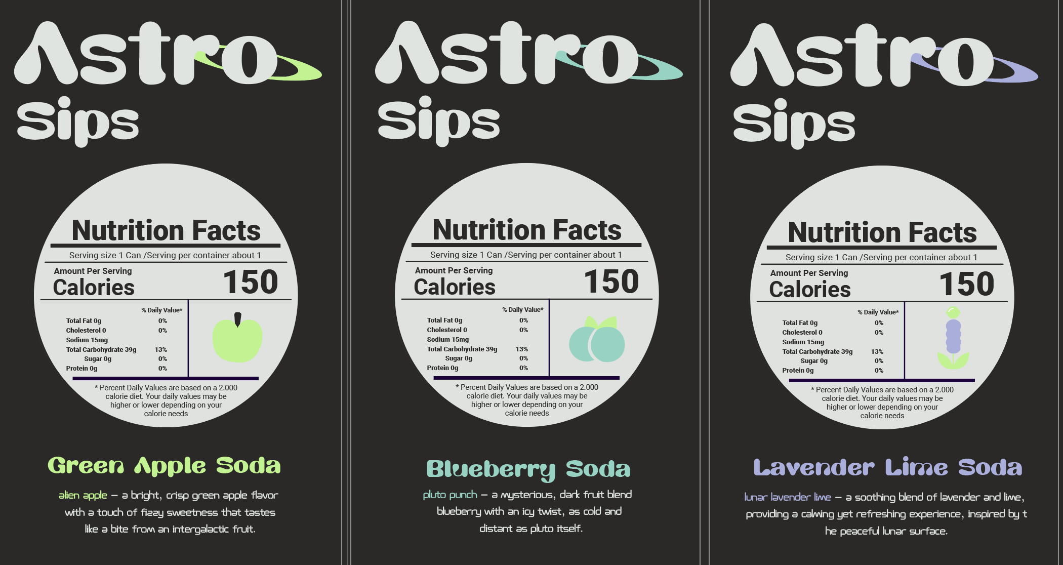
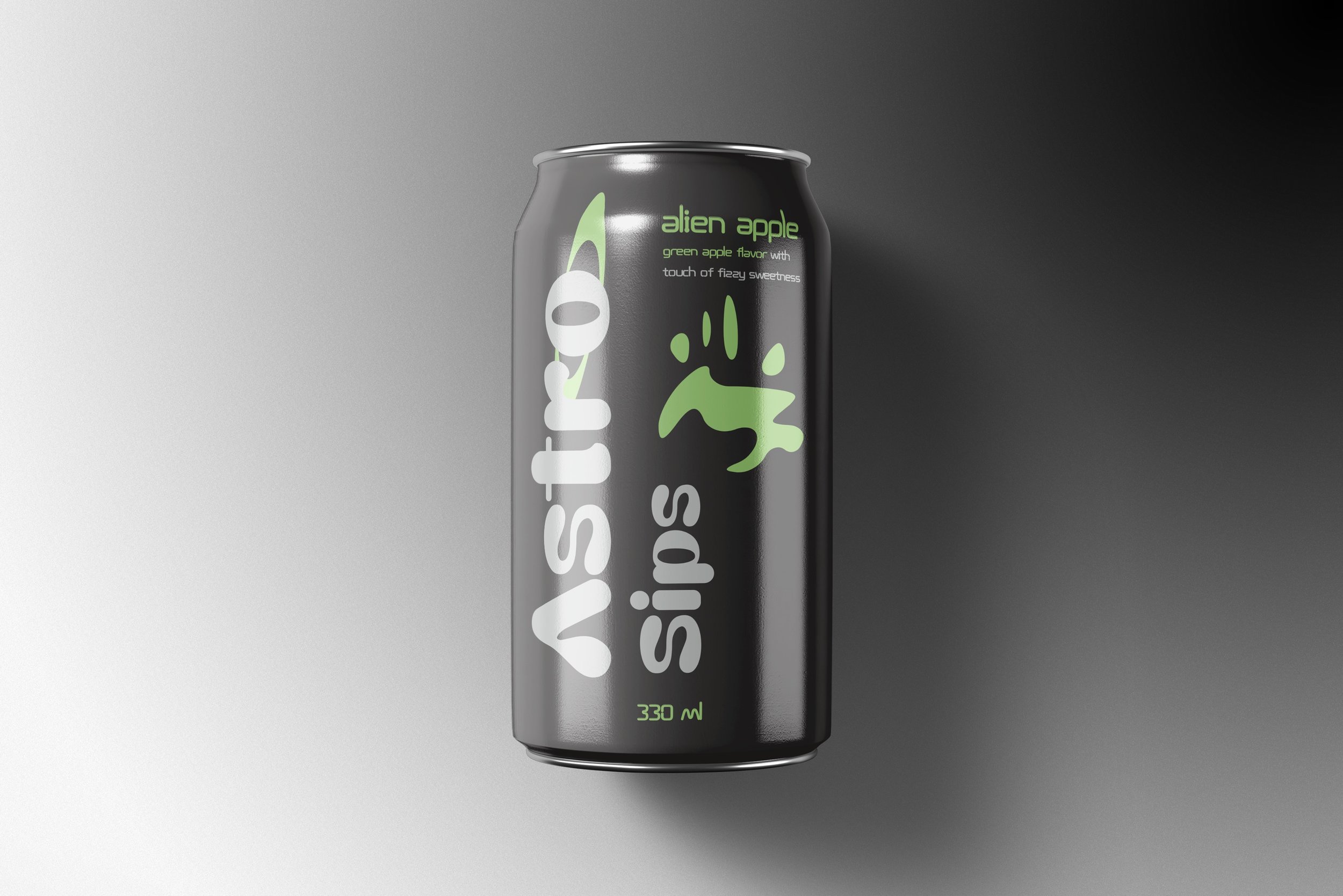
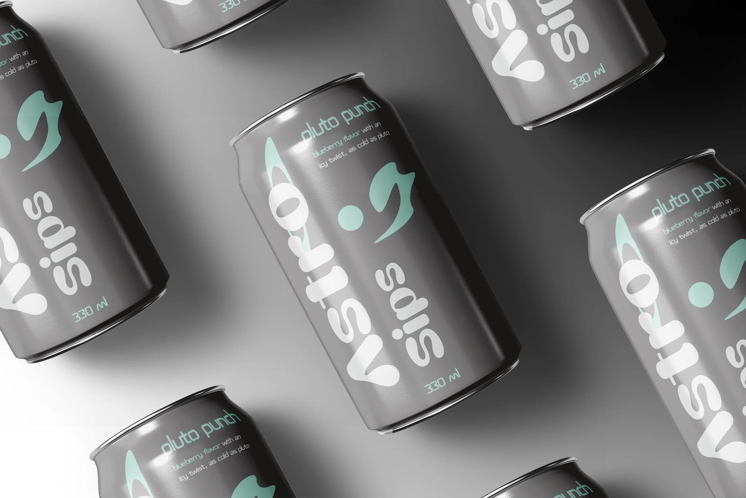
The packaging design for Astro Sips is a visually captivating fusion of imagination and cosmic exploration, inspired by the idea of alien cultures and outer space. As a passion project, the design aimed to transcend the literal depiction of space and instead evoke the mystery and wonder of the unknown through abstract and symbolic elements.

Astro Sips Overview

Astro Sips invites you on an exciting flavor adventure that transcends the usual. It hints at exploring the cosmos without focusing on planets or spaceships. The design captures feelings of infinity, the mysterious, and the unknown.

Color Palette

Astro Sips’ colors not only show the flavors but also create a feeling of space travel. The bright colors reflect the excitement of a space journey, with each soda flavor acting like a ticket to another world. The neon and cosmic colors make each flavor feel like a unique stop in an exciting space adventure, highlighting the fun and adventurous theme.

abstract and symbolic elements.

One of the key features of the design is the use of extraterrestrial writings—a deliberate choice to convey a sense of alien communication. These symbols and scripts represent the idea of an advanced, unknown civilization, with each unique flavor of the soda being translated into a different script or visual language, reflecting the diversity of tastes from other worlds. This not only reinforces the cosmic theme but also subtly engages the imagination of the consumer, inviting them to decode and interpret these alien messages through their own personal experience with the product.

Previous
Previous

Tri-C Transfer Center

Next
Next

Tagged Thrills Skate Co.